
Now, I know what you are thinking; “of course the trend is our friend!” Who among us hasn’t head this adage from either an online “guru” or one of the many Market Wizards’ books? If an asset is moving in a particular direction, then regardless of what you are doing its best to go with it instead of against it. But have you ever seen is quantified? I have personally used trend filters to help aid my bots with their trading, but I have never looked at the behavior of BTC while it is on either side of these indicators. For the sake of this article, I am going to be looking at the daily timeframe and examine a simple moving average filter and an exponential moving average filter to see what sort of historic edge they can provide us with.
So let’s get right into it by first importing our data and setting up our experiment, similarly to how we did it last time but with a few little twists for a better finished product.
# howitzer is my own python library used it interface with some of the other downtocrypto related libraries
from howitzer.util.trading import *
from howitzer.util.stats import *
from enum import Enum
from datetime import datetime
import numpy as np
import matplotlib.pyplot as plt

 # I will find some way to zip and send this data eventually
chart = chartFromDataFiles("C:/Users/Alex/Desktop/overlord/HistoricData/Cbp/BTC-USD", datetime(2016,1,1), datetime(2021,11,30))["daily"]
# Function to append percent change x days ahead
def lookForward(candles, index, distance, _list):
    if index + distance < len(candles):
        close = candles[index].close
        temp = round(100*(candles[index+distance].close-close)/close,1)
        _list.append(temp)

# Function to get the highest high that occurs from the inspected candle to x days ahead
def lookForwardHigh(candles, index, distance, _list):
    if index + distance < len(candles):
        start = index+1
        highs =  list(map(lambda candle : candle.high, candles[start:start+distance]))
        high = max(highs)
        close = candles[index].close
        temp = round(100*(high-close)/close,1)
        _list.append(temp)

# Function to get the lowest low that occurs from the inspected candle to x days ahead
def lookForwardLow(candles, index, distance, _list):
    if index + distance < len(candles):
        start = index+1
        lows =  list(map(lambda candle : candle.low, candles[start:start+distance]))
        lowestLow = min(lows)
        close = candles[index].close
        temp = round(100*(lowestLow-close)/close,1)
        _list.append(temp)

# Bring it all together and deliver it to the masses
# Making 1, 2, 3, and 4 part of the default
def Experiment(filterMethod=lambda c, o : True, compareMethod=lookForward,timeSteps=[1, 2, 3, 4, 5, 10, 20, 30], min_candles=0):
    sampleCount = 0
    candlesToLoopThrough = chart.candles.copy()
    #candles are loaded in gdax (coinbase pro) order, most recent first so they need reversed to do a sequencial run through
    candlesToLoopThrough.reverse()

    total_candles = len(candlesToLoopThrough)

    catagories = []
    for step in timeSteps:
        catagories.append({"distance":step, "values":[]})

    for i in range(len(candlesToLoopThrough)):
        offset = total_candles-i-1
        if filterMethod(chart, offset) and i > min_candles:
            sampleCount += 1
            for cat in catagories:
                compareMethod(candlesToLoopThrough, i, cat["distance"], cat["values"])

    values = []
    for cat in catagories:
        x = cat["distance"]
        values.append(average(cat["values"]))
    return values

#New stuff to hopefully make data more readable
def autolabel(rects, ax):
    """
    Attach a text label above each bar displaying its height
    https://matplotlib.org/2.0.2/examples/api/barchart_demo.html
    """
    for rect in rects:
        height = rect.get_height()
        ax.text(rect.get_x() + rect.get_width()/2., height,
                f"{round(height,1)}",
                ha='center', va='bottom')

def GraphAsOneChart(sets=[], tick_labels=[], set_labels=[], y_label=""):
    plt.rcParams['figure.figsize'] = [16, 10]
    N = len(tick_labels)

    ind = np.arange(N)  # the x locations for the groups
    width = 0.25       # the width of the bars

    fig, ax = plt.subplots()
    rects = []
    for i in range(len(sets)):
        rects.append(ax.bar(ind+(width*i), sets[i], width))

    # add some text for labels, title and axes ticks
    ax.set_xticks(ind + width / len(sets))
    ax.set_xticklabels(tick_labels)

    ax.legend(list(map(lambda rect : rect[0], rects)), set_labels)
    ax.set_ylabel(y_label)
    for rect in rects:
        autolabel(rect, ax)

    plt.show()

# Values we will use throught the report
x_ticks = ["1 Day", "2 Days", "3 Days", "4 Days", "5 Days", "10 Days", "20 Days", "30 Days"]
baseline_close = Experiment(min_candles=200)
baseline_highest_high = Experiment(compareMethod=lookForwardHigh,min_candles=200)
baseline_lowest_low = Experiment(compareMethod=lookForwardLow,min_candles=200)
Changes
Before we get into the data lets address some changes since the last article. First off, the filter call was updates to pass the full chart object and the offset of the current candle relative to the reverse order the candles are stored in. Secondly, I created a better graphing function to compare the results from our experiments. Lastly and most importantly I added a ‘min_candles’ option to our experiment. Since the indicators require a minimum number of candles to calculate their values, we cannot run a test until we have that many candles. To make sure we are comparing the same data to each other we need to only include values that occur when that is true even for our baseline. What does this mean? For all intent and purpose our actual dataset begins 200 days after January 1st, 2016, UTC. We will have a little less to go by but will have the most accurate comparison possible. The alternative was to take the SMA for as many candles as we had which could have been too noisy for my liking.
Hypothisis
The most basic of trend filters is the 200-day simple moving average. Why 200? That is unknown, but it is commonly used across a variety of example of trading systems across the internet. Though the SMA is a lagging indicator (as most indicators are) it is hypothesized that price action above its value will provides a slightly better than average performance by avoiding periods where price is trending downwards. Now on its own it is not perfect as for a bullish example you will miss the beginning of a bull market and catch the beginning of a bear market.
So lets take a look and see how it works.
def above200Sma(chart, offset):
    close = chart.candles[offset].close
    return close > chart.SMA(200, offset)

_200sma_above_close = Experiment(above200Sma, min_candles=200)
_200sma_above_high = Experiment(above200Sma, compareMethod=lookForwardHigh, min_candles=200)
_200sma_above_lows =  Experiment(above200Sma, compareMethod=lookForwardLow, min_candles=200)

GraphAsOneChart([baseline_close, _200sma_above_close],
                x_ticks,
                ["Baseline Closes", "Above 200 SMA Closes"], y_label="Percent Change")
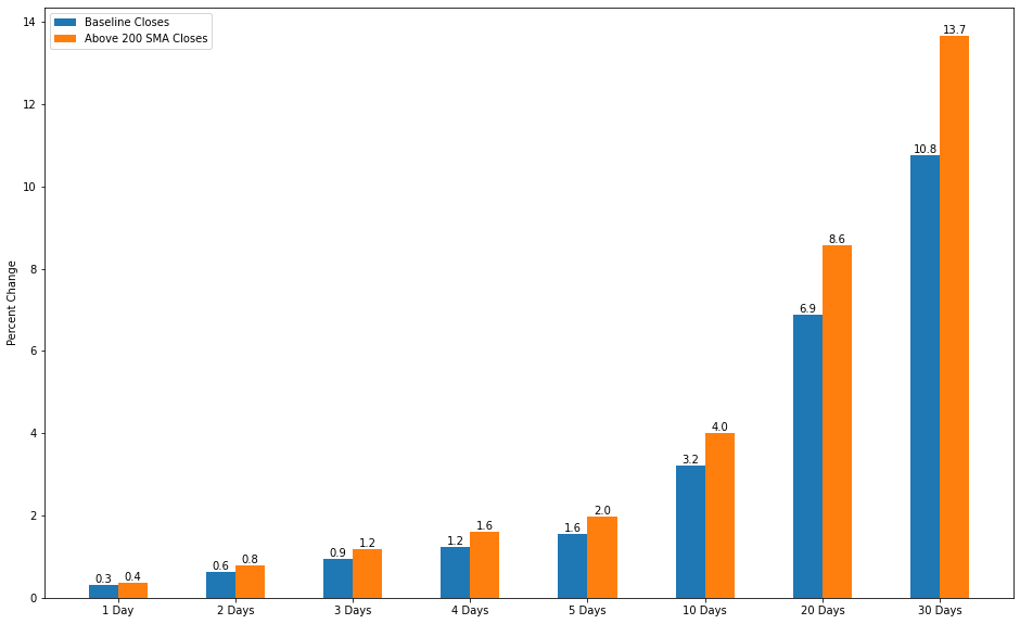
Observation: Closing Prices
Well for starters this is a much better graph!
By every single measurement the closing price is improved while above the 200-day SMA from 25% to as much as 33%. This does give a us a bit of the edge in the market. This is most likely due to the market continuing to trend upward for most of the time that the price is above the SMA.
GraphAsOneChart([baseline_highest_high, _200sma_above_high],
                x_ticks,
                ["Baseline Highest Highs", "Above 200 SMA Highest Highs"], y_label="Percent Change")
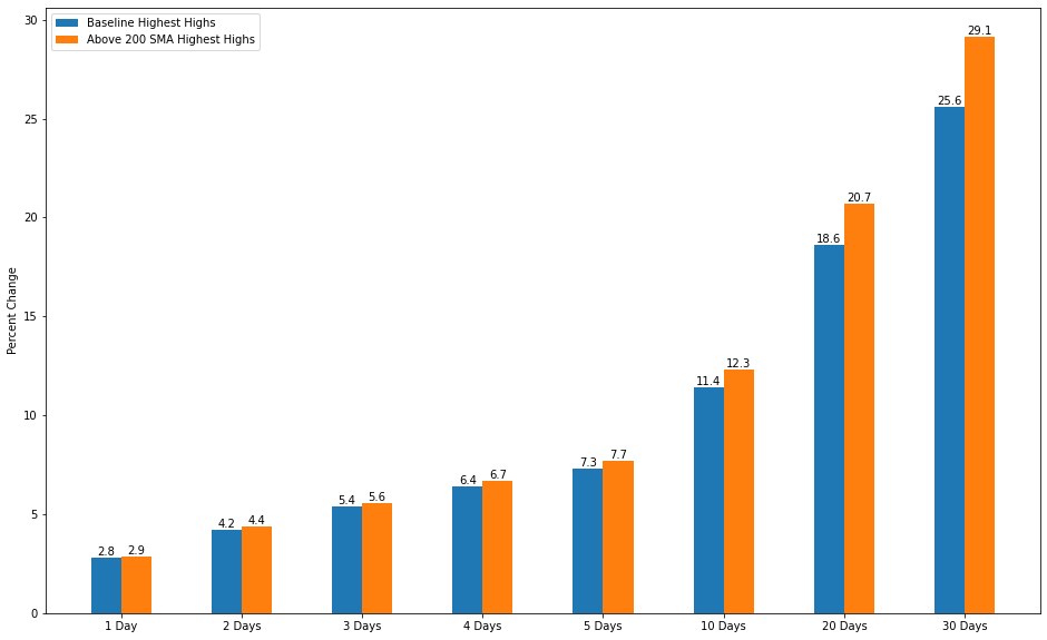
Observation: Highest Highs
For the Highest High and Lowest Lows there is little improvement. Both metrics are more representative of price volatility rather than the direction of price. BTC being the volatile asset that it may seem to get more volatile as price pushes upward but not by much more than usual. The differences here are too small to make a definitive answer and this may prove an interesting point of study down the road.
GraphAsOneChart([baseline_lowest_low, _200sma_above_lows],
                x_ticks,
                ["Baseline Lowest Lows", "Above 200 SMA Lowest low"], y_label="Percent Change")
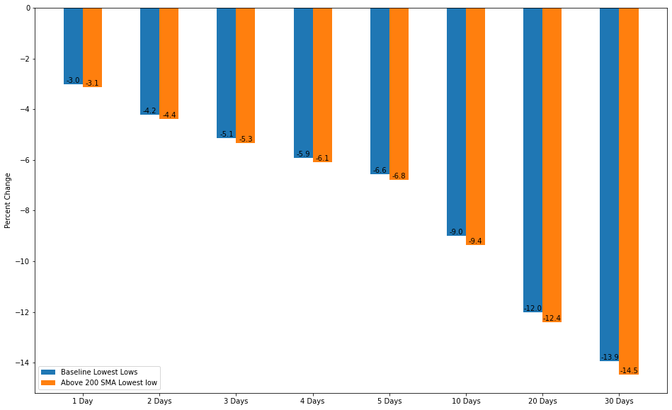
Observation: Lowest Lows
This asymmetric change in the values of the lowest lows you need to tolerate and the closing prices that are reached provides some advantage to trading strategies deployed under these conditions. This is already something I am exploiting with my bots, but I do not have a way to quantify what was happening until now
Hypothisis 2
Now as mentioned before the SMA lags price action. If one were to desire a more responsive indicator, they could shorten the length of the average, but this would simply look at less information. If one would want to use the same amount of information but want a more responsive indicator, they could use an EMA. The EMA looks at all the values but weighs the most recent values more heavily than the older values, thus allowing it to respond faster to price movement. The theory is that this will get in quicker on the bullish side and exit sooner on the bearish side, thus providing a better overall outcome.
def above200Ema(chart, offset):
    close = chart.candles[offset].close
    return close > chart.EMA(200, offset=offset)

_200ema_above_close = Experiment(above200Ema, min_candles=200)

GraphAsOneChart([_200sma_above_close, _200ema_above_close],
                x_ticks,
                ["Above 200 SMA Closes", "Above 200 EMA Closes"], y_label="Percent Change")
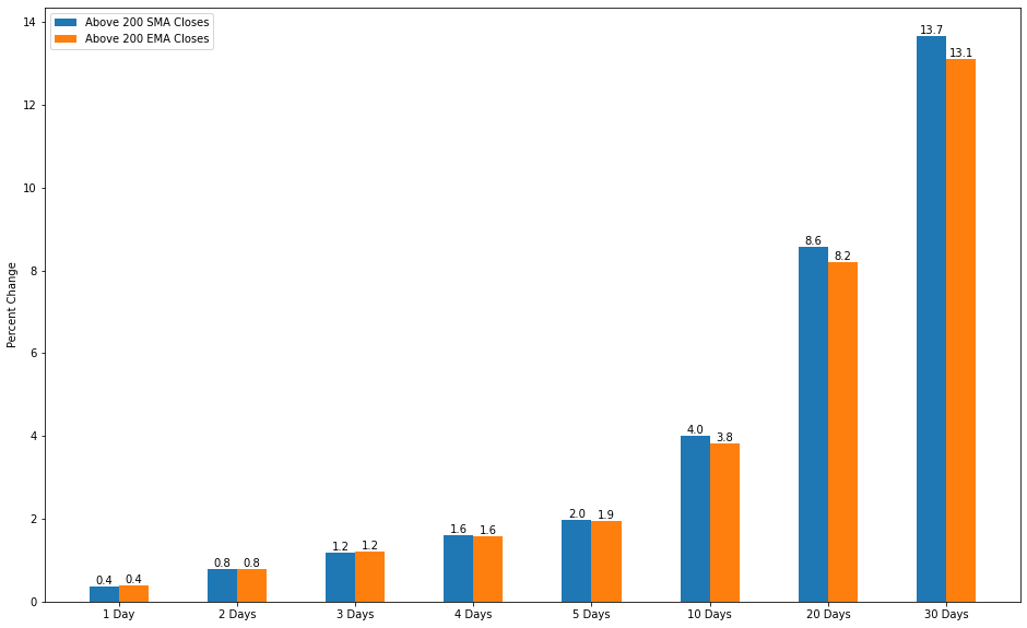
Observation
Interesting.
Comparing the two simply on closing prices yielded some unexpected results. The EMA gives similar if not slightly better gains in the time frames less than 5 days. Anything 5 days or longer it begins to underperform the SMA. This is likely due to the nature of the EMA react quicker to price changes than the SMA meaning it remains closer to the current price then the SMA does at any given time. If price were to shoot up suddenly it may not go as far up as the SMA which lags further behind, but it could cross the EMA which is closer to it. If this move was only temporary, then the look ahead would see price continuing to fall.
Optimization of an Existing System
Currently I am using a 100-day SMA filter on one of my strategies to determine if I am in a bullish or bearish market.
Where did I come up with 100? Nowhere praticular it just seemed good and it worked.
This sort of haphazard development process is something I wish to do away with so lets see if we can come up with a reason to use another value.
def above100Sma(chart, offset):
    close = chart.candles[offset].close
    return close > chart.SMA(100, offset=offset)

def above100Ema(chart, offset):
    close = chart.candles[offset].close
    return close > chart.EMA(100, offset=offset)

_100sma_above_close = Experiment(above100Sma, min_candles=200)
_100ema_above_close = Experiment(above100Ema, min_candles=200)


GraphAsOneChart([_200sma_above_close, _100sma_above_close, _100ema_above_close],
                x_ticks,
                ["Above 200 SMA Closes", "Above 100 SMA Closes", "Above 100 EMA Closes"])
Conclusion
It appears like my haphazardly derived value is a good fit after all, better lucky than good I suppose.
Overall, for my trading I am going to lean towards using the SMA over the EMA as a regime filter as it yields slightly better though comparable results but requires far fewer calculations.
It is my hope that these filters can help me reduce risk and improve the reward of my trading as well as something for you to ponder as you go about yours. Final reminder that none of this is financial advice.
General Update
So, this is going to come out on the last Wednesday of the year so let’s give a solid state of things.
Trading wise the year went very well. As discussed in a previous post I could have done far better but I am taking it as a lesson learned, accepting my tuition bill to the markets, and prepping for the next round. Currently I am sitting in an ETH-USD trade (as of 12/23/2021) and nothing else. Last week I blead a little buying some mean reversion signals but other than that price is below my previously discussed regime filter, so things are quiet.
As far as software goes, I am taking on the rather large endeavor of rewriting everything to use C#, for the backend of the platform, angular for UI and python for the bots and research. The hope is to make a more deliverable product with far less hoops to jump through to get going. NodeJs is still one of my favorite languages, but I hope to leverage aligning what I do at my nine-to-five and my free time to excel at both. I hope to have a run down of my new system sometime in late January or early February.
I hope everyone had a Merry Christmas and is set to have a Happy New year!
Thanks for stopping by!